Showing posts with label Shimmer. Show all posts

Scofflaw Summer Colors Swatches and Review

(**Press Samples**)
Hello and happy Monday darlings! 

  Today I have a few swatches of a, new-to me, handmade nail polish line. I know Scofflaw has been around for sometime, and I had bee eyeing them with a vengeance haha. The only pretty I owned by this brand was in the form of a nail polish pendant of David Bowie's Bulge that was made for me by the lovely BeadsInk. So, when Finch got in touch with me about featuring her new Summer shades I jumped at the chance. 
scofflaw summer photo Scofflaw_zps98de3158.jpg
 All of these polishes are so complex, yet beautifully executed. I am so beyond impressed with her unique blends and beautiful use of shimmering bases. All four of these shades had fantastic formulations as well. All swatches are shown with a top coat. 

Scofflaw Little Edie in the Grey Gardens
Scofflaw Little Edie in the Grey Gardens photo DSCN5864_zps6edbb1cc.jpg
 First I have to talk about how much I love the name/ inspiration behind this color. For some time I was fairly fascinated by the story behind "Grey Gardens". Something about this polish really does capture the essence of Little Edie for me. Little Edie in the Grey Gardens is an ethereal blend of Pastel Yellow hexes, Coral hexes, Lavender squares and small Golden glitter all suspended in a very light, squishy Grey base. The kicker is the fantastic Yellowy-Green shimmer in the grey base. I love how delicate, yet unique and eye catching this blend is. I used Three easy coats of color for my swatch. 

Scofflaw Paranoid Android
Scofflaw Paranoid Android photo DSCN5854_zpsb727d7d1.jpg
So.Much.WIN!!! Paranoid Android is a chunky blend of Black, Red, Silver and *I think* Plum hexes suspended in a shimmery, squishy Sky Blue base. There are also some smaller Blue glitters that really add some serious twinkle to this pretty. I love, love the blend of colors here. The Red particles really bring this color to life for me. I used Three thin coats of color for my swatch. 

Scofflaw Wyld Stallyns
Scofflaw Wyld Stallyns photo DSCN5839_zps6b2e43fb.jpg
 Wyld Stallyns is a shimmering Red-toned Purple base accented with hot Pink squares and Plum hexes as well as small Golden twinkling glitter. I think I also picked out some Blue particles and larger Golden hexes. This shade had the "sheerest" formula of the bunch as the base is an actual shimmer and not a squishy creme. I used Three thin coats of color. 

Scofflaw Electric Salamander
Scofflaw Electric Salamander photo DSCN5809_zpscc213dbb.jpg
 Electric Salamander is an AMAAAAZING mix of Blue and Green hexes. There is a mix of Sparkling and matte glitters here that is just perfection. The base color is an interesting, shimmery White-Grey. I just love this color, the Blue hexes are perfect in this base color. The application on this shade is very good, I used Three coats of color. 

 Scofflaw is available from Shop Llarowe as well as Etsy. These babies were just released a few weeks ago. I am so seriously impressed with everything about this polishes. The only one I was not crazy about was Wyld Stallyns, but that is a personal preference thing. The other Three shades have completely won me over.

 I also want to take a quick second to thank the amazing Nikkie of Nikkietutorials on Youtube for mentioning LTHP on her June faves video. I'm still in shock and just so ecstatic and fangirly. I am a huge fan of Nikkie's work and her personality. She has accomplished so much at such a young age, makes me feel lazy haa! She has also lit a fire under my butt to finally write out a post on my nail care routine. Which I will certainly be doing soon. THANK YOU NIKKIE!!! It seriously means to world to me ♥.

Have you had a chance to try Scofflaw's creations yet? Which are your favorites? From the ones I just went over today, I cannot pick a fave. I am in love with them for different reasons. They are all just so unique and beautifully made. 

More aboutScofflaw Summer Colors Swatches and Review

Summer Ready Swatch Spam!

(**Press Sample**)
Hello my loves! 

  Today I have some swatch-y spam for you guys. I've had these pics sitting in my folders for some time now.... So I figured, why not do a spam post?
Summer Swatch Spam photo FridaySpam_zps91f66cc1.jpg
 These shades are all kinda screaming Summer to me. What are some of your favorite Summer shades? Or do you not really follow seasonal colors? Me, I kinda wear what I want, when I want. But I do tend to gravitate to Spring and Summer shades because they are always so bright and happy. 
 All of these swatches are shown with a top coat. 

LVX Nail Color in Mynt
LVX Mynt photo DSCN5978_zps1782230b.jpg
 Mynt by LVX is a lovely, clean Mint creme. I found the formula on this shade to be AMAZING. Normally, these types of Pastel-ish, minty greens can be a pain in the butt to apply. That was not the case with this beauty. I did Three easy coats of Mynt for my swatch. 

LVX Nail Color in Deco
LVX Deco photo DSCN5940_zps747e371d.jpg
 Deco is an amazing shade of Melon-y Coral creme. I knew I would love this shade the second I unpacked it! I am a sucker for these types of colors. This shade is insanely flattering and easy to wear. I used Three thin and easy coats of Deco for my swatch. 

Zoya Gaia
Zoya Gaia photo DSCN5881_zps4a59189f.jpg
 Gaia, Gaia, Gaia... This color.. Ok.. So this color is BEAUTIFUL, stunning really... A Pearly, shimmering White with the most perfect Golden shimmer running though it. Bridal perfection... That said, this color has a horrid formula! I found it to be patchy and uneven.. I needed Four thin coats to get it to look even and opaque. Maybe layering it could remedy that problem, but it could also ruin that squishy effect... I suppose the color payoff is definitely worth the work I put into the application though. 

Essie Tart Deco
Essie Tart Deco photo DSCN5498_zpsaa6841cb.jpg
 Tart Deco is a vivid, hot Melon-Coral shade. This shade is a more vibrant cousin to LVX Deco. The formula on this color is a little patchy, but not problematic. I used Three thin coats for my swatch. 

Zoya Sari
Zoya Sari photo DSCN5471_zps6d38146a.jpg
 Sari is a lovely, nude Pink jelly. Colors like these are great for French manis, or just to add a healthy glow to a nakey-look. I used Three thin coats for my swatch. 

LVX Nail Color in Indigo Bleu
LVX Indigo Bleu photo DSCN4846_zps39a2df1e.jpg
 Indigo Bleu is a deep Violet-Blue creme. This shade is intenesely pigmented and very easy to apply. I could have almost done with one coat. I used Two thin coats for my swatch. 

Zoya Josie and Zoya Destiny
Zoya Josie and Destiny photo DSCN4905_zps9f33f6f8.jpg
 Zoya Josie is a beautiful Grass Green creme that applies like a dream. I used Two easy coats of Josie. For this look I did an accent in Zoya PixieDust in Destiny. Destiny is a hot Coral texture laced with strong Golden shimmer. I used Three thin coats of Destiny. 

  Any faves in this bunch? I am really in love with Gaia. I hate the formula on that color, but my gosh it is just beautiful! I also really loved Mynt and Deco by LVX. Though I must admit, this Summer has turned into the "Summer of the Textures" for me. I've been wearing Textures non-stop since they all started coming out! 

 What have you been wearing lately?

More aboutSummer Ready Swatch Spam!

O.P.I Couture de Minnie Collection Swatches

(**press sample**)
Hello my darlings and happy Friday! 

  I am so very sorry about the minor posting hiatus. We had some MAJOR personal stuff go wrong last week. Basically, I was "ready to jump"... It was absolutely nothing blog related. Just life... doing it's thing... being a beyotch. But, things are settling down and falling in place so I'm feeling positive and keeping my head up. 
 Then yesterday, I was trying to get these photos edited and I was having all kinds of issues with the editor I use. I was pretty hissy... Full Moon maybe? Luckily I found an alternative in Photobucket, which I had not used in YEARS. I was bummed, because I've been desperate to share my swatches of O.P.I's new Couture de Minnie collection for Summer. If you are going "Whit a minute, didn't O.P.I do a Minnie themed collection for Summer last year?" Why yes, yes they did, and apparently they had a really positive response. This year they gave Minnie a high-fashion look, and Five new adorable shades for the Summer months. 

 photo ced48b62-04dc-40af-a293-b54ec339be9d_zps475bbed6.jpg
 All of these swatches, with the exception of Magazine Cover Mouse, are shown with a top coat. 

O.P.I Liquid Sand in Magazine Cover Mouse
 Magazine Cover Mouse is a light, Red based sparkling texture laced with strong Golden, Silver and Pink micro shimmer. I LOVED the (almost) duochrome look to this liquid sand. I really must admit that this was a heavy and instant favorite for me. I love the hints of Pink sparkle and the overall "Minnie-ness" of it all. I used Three thin coats for my swatch. This texture dried fairly fast. If I had to pick just ONE color to get from this collection, it would be this beauty!

 photo DSCN5408_zps11a96da5.jpg
One hour after application
O.P.I Innie Minnie Mighty Bow
 This shade is your classic Candy Apple red with strong Red and Golden micro shimmer for added dimension. This color has a very saturated formula and could well be a one coater. I used Two thin coats for my swatch. This color will be fantastic during Holidays. 
 photo DSCN5382_zpsda4e66ce.jpg

O.P.I A Definite Moust Have
 This shade is described by O.P.I as a Fuchsia.... I saw hot Coral. It was hard shade to capture because it is SO vibrant. This shade is very similar to Come to Poppy from the Nice Stems Collection. This shade is a bit more vibrant and extremely saturated. I did Two easy coats for my swatch. 
 photo DSCN5351_zps89efd7b5.jpg

O.P.I Minnie Style over O.P.I Chic Comes Ears to Tail 
 OMG I LOVE THIS GLITTER. Ok, now that THAT is out of my system haha.. This cute confetti- style glitter is a simple blend of White, Pink and Red hexes packed in a clear base. I was impressed with how easy it was to work with. I only did one coat of glitter over my base color. 
 photo DSCN5329_zpsddcb9a81.jpg

O.P.I Chic from Ears to Tail
 What would a Summer/Minnie- themed collection be without your classic Bubblegum Pink creme? This shade is adorable. There is the slightest hint of Silver micro sparkle. It is SO barely there, can barely be seen in Sunlight even. I do think that the shimmer did wonders for the formula on this shade. I used Three easy coats for my swatch. 
 photo DSCN5314_zpsfd49637d.jpg
I like this collection a lot more than I thought I would. They really got me in my soft spot with the fantastic Liquid Sand Shade Magazine Cover Mouse and the adorable glitter in Minnie Style. In last year's Minnie collection they went with the more retro-cutesy side of Minnie. This collection is Minnie all grown up. For that, I love these colors.

Are any of the shades in this release speaking to you? Which Minnie Couture would you rock?

(**Press Sample**)

More aboutO.P.I Couture de Minnie Collection Swatches

Sation Candylandia Gradient Nail Art and an Update

(**Press Sample**)
Good afternoon everyone!! 

  Last night I took a little poll on the Facebook page to see what you guys were interested in seeing today. Out of all the options you guys voted for "a gradient", so a gradient it is :D! Many of you also suggested a Textured gradient, that will DEFINITELY be happening soon! Today's gradient features some lovely, awesome shades from Sation's Candylandia collection. For this gradient I was inspired by [THIS PAIR] of Black Milk Clothing leggings.
  Before I go onto the nail art I wanted to give you guys a little update on my visit to The Mayo Clinic in Jacksonville, FL. Not much happened as this was an initial consult visit. I did get scheduled to go back in June for about Four days of tests. It is going to be a long process, but I finally feel like I am at the right place, with the best doctors. I have not felt hopeful in a long time, this visit changed that for me.      
  The doctor who consulted with me was like no doctor I've ever spoken with before. He really inspired a lot of confidence in me and was very kind. He actually listened to what I had to say and showed legit concern. This is not something I want to be going through, but I am glad I am finally being treated by a great team of doctors at an amazing facility. 
  Now for a miss Muffin update: my poor kitty has a cold! But worry not, she has been to the Vet. She was given a shot of slow-release antibiotics. She is acting fine and active, eating etc, but I didn't want to bug her over the weekend as I could tell she felt "off". How 'bout that gradient!!? 
 This look started with a base of Sation's Love is in the Heir, which is a light, Greyed out Blue crelly. Using this shade as my base color mae all the difference when it came to building up my gradient. The light Blue tone really brought out the colors I was using to gradient over my light Blue shade. For the gradient I used colors from Sation's Candylandia collection. I went with Plenty of Frogs, Cast a Spill on You and Super Nail-tural Powers. I.LOVE.THIS.GRADIENT!!! I loved it SO much I didn't even do my signature coat of INM Northern lights!! WHAT?!! LTHP didn't put Northern Lights on a gradient?!!!!!! I know, I know haha... But just look at that shimmer from Cast a Spill on You(Blue) and Plenty of Frogs! 
 This was probably the easiest gradient I've ever done and I chuck that up to combination the base color and the formula of the shades I used to gradient. The shimmers really made the seams blend effortlessly and created such beautiful airbrushed-looking surfaces. Choosing the correct base color for gradients really does make a difference and I am just now learning this myself. I should film a tutorial on how I do my gradients, huh? I know everyone has their own way of doing them, and you guys have been asking for a while... I've just been a horrid Youtuber :(.

 Here is a shot of my base color Love is in the Heir. This shade comes from Sation's Marie Antoinette inspired collection. This shade is a soft, muted Blue with some slight Grey undertones and a subtle twinkling Silver sparkle. Finish-wise it is between a creme and a jelly, more jelly than creme. The formula was smooth, even and easy to work with. I used Three thin coats since I wanted to show you guys a swatch of this shade as well. Girls with longer nails, or those of you who are not a fan of "visible nail line (VNL)" might need a few more coats for full coverage. I really enjoy soft, dreamy shades like this one. Do you?
 I am SO sorry about the hiatus over the past week. I'm hoping to break that cycle of absences for a while. I have SO much nail polish to go through. I also got some new stamping plates, the Pueen sets! I had not gotten new stamping plates in like a year or so! I am SO excited about these Pueen plates though, they are ADORABLE!

 And just a quick reminder that Google reader will be going away on July 1st! I've set up shop over at Bloglovin. I just LOVE how easy it is to use and they also have an iPhone/Droid app! Make sure you are following LTHP on Bloglovin so you don't miss out!! Also, [HERE] is a full list on ways to keep up with the Let them have Polish! nonsese!
Follow on Bloglovin

 I've really missed you guys so very much! I hope you guys liked this gradient! I kinda wanted to eat my nails when I wore it :)!

(**Press Sample**)
More aboutSation Candylandia Gradient Nail Art and an Update

OCC Lip Tar and Nail Color in Power Plant

(**OCC products provided for review consideration**)
Yay Friday!! 

  Today I have my very first OCC nail color evar! OCC is a brand that I've had a major crush on for a while now. I am a HUGE fan of Lip Tars and I've read nothing but fantastic things about their pigments and nail color. Well, recently OCC released an awesome new collection (Sci-Fi Lullabies) and I got a chance to try out Power Plant. This is their new shimmery-metallic Sage Green nail and lip color. All I can say is OMGWOW! 
 I kinda love the picture above. I would have never thought I would have liked Green lips on me! I need to practice applying lip tars, especially this shimmery ones. I should have done a light coat of concealer on my lips to bring out more of the Green in the lippy... Anywho, Power Plant lip tar is a beautiful, minty shade of soft Green with strong metallic shimmer. It's a bit sheer (when compared to my creme lip tars) but it can built up easily. I do like that it  is slightly sheer as it makes it versatile in terms of layering, gradients and such.

 And here is OCC Power Plant nail color. The nail version of Power Plant is a more vivid shade of Green. I would call this a Spearmint Green. The shimmer in this shade is just amazing! I love that Silvery-Green-Blue micro shimmer that seems to float over the green base color. When you read about "glowy" colors... THIS is what we are talking about ♥. The formula on this shade is incredibly smooth and even. I only needed Two effortless coats for full opacity. I.LOVE.This.Color! This is everything I wanted Barielle Snap Dragon to be and MORE. 

 And here is a swatch of Power Plant lip tar. I will have better pictures soon. But I do really like this color and the soft, pastel-ness of it all. Right on trend for Spring!! I hope I master this lip tar soon because I really want to wear it out and scare all the old peeps in my town lol!!! 

 What is a brand that you have always loved, even before getting to try it out? Mine were Sugarpill (OMG how I lemmed Sugarpill!!), OCC and BFTE Cosmetics. And now that I am familiar with all Three brands, I have nothing but praise for their biz ethics and fantastic products! 

 And how about "unusual" lip colors? Would you rock a Green lip?  


(**OCC products provided for review consideration**)
More aboutOCC Lip Tar and Nail Color in Power Plant

Muffin Monday! O.P.I Eurso Euro- Mixed Texture Nail Art

(**O.P.I Products provided for review consideration.**)

Hello and happy Muffin Monday!

 Look at me getting a Muffin Monday out on time!!! I won't even blab much and get straight to it! This week Muffin picked me a most amazing shade of vivid Cobalt Blue by O.P.I called Eurso Euro. This shade is from the Euro Centrale collection. I wanted to keep the look simple, but interesting. So I did a mixed texture look featuring some of O.P.I's Liquid Sand shades as well as Muffin's pretty pick. 
 For this look I started with a base of Three coats of Eurso Euro and Oy Another Polish Joke(Golden shade) by O.P.I. I LOOOVE these Two shades together. I've had a soft spot for Blue and Gold since they were my High School colors. Plus, there is something so regal about the combination. Anywho, I did my base colors and top coated them with some Seche and waited to make sure they were dry enough to move forward with the Half-moon details. For the half moons I used Get your Number and What Wizardry is This? liquid sands. I waited a good 45 minutes before photographing this look to make sure the texture polish had dried enough for there to be a good contrast between the shiny bases and the textured sand polishes.

Look at Muffin go!

 And because I also loved these polishes on their own... Here are Eurso Euro and Oy Another Polish Joke. Both were an easy Three coats of color to reach full opacity. I ran into no issues with the formulations. OAPJ was a little sheer but did well in Three coats. It can also be layered.
 What do you guys think of the mixed- texture moons? I really liked the look of the shiny and "rough" together. I'm sure this type of mani would hold up well, these textured polishes have been wearing like iron on me! I've been really enjoying this O.P.I Spring Collection. I think it's one of the best Spring collections by O.P.I in a while!

Would you try a mixed texture look?

 (**O.P.I Products provided for review consideration.**)
More aboutMuffin Monday! O.P.I Eurso Euro- Mixed Texture Nail Art

China Glaze Avant Garden Collection Swatches- Part One

Hello!! 

  Yesterday I held a little "poll" on Facebook to see what you guys wanted to see today and ya'll voted for the China Glaze Avant Garden swatches. This post will focus on Six of the Avant Garden Shades (and yes, I will be sharing the other six shades :). 
 China Glaze did a beautiful job with this collection. All the colors are definitely Spring-perfect and they all compliment each other. There is a nice range of shades in this 12 piece collection. 
 To see close ups of these pretties just continue reading ♥.

China Glaze Fade into Hue
Fade into Hue is a dreamy shade of Periwinkle creme. This polish gave me a little bit of trouble with photos. It kept wanting to come off a tad more vibrant in pictures than it is in person. Think of this shade with strong Grey undertones. Like a cloudy Sky Blue. I'm not sure how this compares to Secret Periwinkle but they might be cousins. The formula on this shade was just a little patchy but keeping a light hand remedies that issue. I used Three thin coats for my swatch. 

China Glaze Keep Calm, Paint On 
 I was SO sure I was going to loathe this color... It was the complete opposite! This might be one of my very top picks out of this entire collection. Keep Calm, Paint On (LOVE the name) is a lovely minty Seafoam green with a strong Pearly finish. My fear with this shade was that it would look dated, or frosty. SO GLAD it is a beautiful Pearly finish with a perfect application. I had no issues with the formula on this one and only needed Two coats for my swatch. Feeling stressed? Put this on your nails, stare at it while counting to 10... You will feel better!

China Glaze Fancy Pants
 Fancy Pants is this trendy shade of vivid Cobalt Blue with subtle Pink- Copper shimmer. The shimmer is so much more evident in the bottle than on the nail. The Blue creamy base is almost too dense to allow the sparkle to show through when the polish is applied. That was a slight bummer. That said, I still adore this shade and the shimmer is obvious enough to make this polish uniquely beautiful. This color has a great formula and could have almost been one coat for me. I did Two coats for my swatch.

China Glaze Dandy Lyin' Around
 Dandy Lyin Around is the most angelic shade of shimmering White. This shade is so chic, clean and just plain pretty. The shimmer in this is very fine and Silvery- Pink so it has a snowy quality about it. The formula was slightly thick but not problematic. I used Three thin coats for full opacity. It is best to wait between coats with this shade. And yes, I will comp this with Frosty. Though I'm sure they are quite different.  

China Glaze Budding Romance 
Budding Romance was an instant favorite for me. This is an edgy shade of Light Olive Green with strong Yellow undertones. This shade has an AWESOME creamy-jelly formula so the finished look is a ridiculously shiny, squishy shade of fierce Green. I used Three thin coats for my swatch. Make sure you are wearing a base coat under this pretty to avoid stains!

China Glaze Tart-y to for Party 
 How great are these names!? Tart-y for the Party is a beautiful shade of cool toned Lilac creme. I love this shade because it is more vivid than other "pastel" Purples to come out this Season. This shade is classic and still beautiful. The formula on this beauty was buttery smooth. I used Two coats for my swatch.

 China Glaze knows the way to my heart. Amazing cremes in fun and interesting colors, fantastic formulas and quirky names... What more could you want? I can't wait to try out the other half of this collection. I am SO in love with the Six in this post. I'd have to say my top picks are Budding Romance, Dandy Lyin Around and Fancy Pants. Fade into Hue and Tart-y for the Party are a refreshing take on the more classic colors. Keep Calm, Paint On is on a league all it's own... Could it be I've found my favorite color for Spring in this collection?

Do you have any picks from this half?

(**CG products provided for my consideration**)

More aboutChina Glaze Avant Garden Collection Swatches- Part One

Lovely Looks with the Zoya Lovely Spring 2013 Collection

Happy Humpday!! 

  Today I have some looks featuring the shades in Zoya's new Spring Collection. The Lovely Collection is made up of Three gorgeous cremes, and Three beautiful shimmering pastels. The second I saw these shades I knew I would be doing some looks with them. I couldn't bring myself to just swatch them, I had to play with them :D. Zoya's Lovely is definitely Lovely!!   

 For my first look I went with a cute half-moon look. I might be a *tad* obsessed with half-moon manis. This simple, but eye-catching, look started with a base of Zoya Blu. Blu is the most perfect shade of light, light Blue creme. I wanted to do something with interesting contrast and a bit of an edge so for my accent color I went with Zoya Piaf. Piaf is one of those shades that are so ugly they are pretty. Piaf is a neat, light Mustard- Chartreuse Yellow with complimenting shimmer. I was pretty sure Piaf would not look good on my skintone but combining it with Blu really made it work for me. I love this combination.

 How could I NOT do a cloud mani with these babies?! For this look I started with a base of Jacqueline. Jacqueline is a pretty, light shade of creamy Ivory. There is a very slight, barely there shimmer in Jacqueline. For my clouds I used Zoya Julie and Neely. The finished look is really subtle, but so perfect for Spring!

 For my final look I wanted to do something striped and simple. I started with a base of Neely. Neely is a gorgeous, light Seafoam creme. For the color accents I used Zoya Julie and GeiGei. I used fine striping tape to create the color-blocked look. On my index and Pinkie I filled in the taped gaps with fine brushes. I really like the end result. These remind me of the girly notebooks I used to carry in High School.

 Here are quick swatches of my base shades. From left to right: Neely, Blu and Jacqueline. These were all two coats and I ran into no issues with the formulas.
 I have a few more looks planned for these pretties. Zoya's Spring Collections are always just gorgeous and inspiring to me. As always, the formulas are a joy to work with. These shades all compliment each other and it makes wearing just one at a time impossible for me!

Did you pick up any of Zoya's new Spring shades?

(**Zoya products provided for review**)

More aboutLovely Looks with the Zoya Lovely Spring 2013 Collection

Cirque Objet d'Art Collection Swatches: Part Two

Good morning and happy humpday!! 

  A total quick, random note: I've decided to take a hint from miss Sarah of Chalkboard Nails and created a dedictaed page for Press Releases and general beauty news. You can visit by clicking [HERE]. I have also created a tab at the top of this blog: "Press Releases" clicking on this tab will re-direct you to the press release page :D. This way those of you  interested in what is coming out don't miss out on the news. And those of you who are not don't have to worry about news cluttering up the pretty nail colors and art ♥. LTHP Press Releases is set up as a "blog" so you can subscribe as you would this one if you are interested in press releases and general beauty industry news. 

  SOO!!! Today I am sharing my swatches of the Second half of the Objet d'Art Collection by Cirque. You can see swatches of the first half of the collection [HERE]. I am so in love with every single polish in this portion I am sharing today. There is something about Cirque nail polishes that is just so classy, yet different and just plain beautiful.
 To see closeup swatches of these beauties just continue reading ♥.

Cirque Planet Caravan 
 Planet Caravan is a Blackened jelly base packed full of multichromatic glassflecks. The shimmer in this beauty is like burning embers and shift from Purple to Copper and Green. The formula on this beauty is easy to work with and does great in Two coats. Planet Caravan was one of my favorites from the entire collection.

Cirque Book of Shadows
 Book of Shadows is a very shimmery, Pewter foil. This shade is a little sheer but it builds up to opacity in Three coats.

Cirque for Mei Mei's Signatures Fleur est Belle
 This shade is a Mei Mei's Signatures exclusive. Fleur est Belle is a soft Pink, shimmery jelly base. Packed in the beautiful base are White and bright Gold Hexes as well as smaller light Green and Pink hexes and squares. Fleur est Belle is a real beauty. I love that even though it is quite chunky, there is something delicate, ethereal and feminine about it. The formula on this polish is a little tricky as it is so chunky. The good thing is that there is no fishing required, just slight manipulation of the pieces. I used Three thin coats for my swatch.

Cirque Cape Liz 
 Cape Liz is a muted, light Blue creme packed full of twinkling Pink, Silver and Blue glassfleck shimmer.  While this color is absolutely dreamy, the formula gave me so trouble. The issue I kept running into was some bad patchiness and dragging. I needed Four coats to get it to look even and fully opaque. At least the color payoff is worth the formula troubles.

Cirque Cypress 
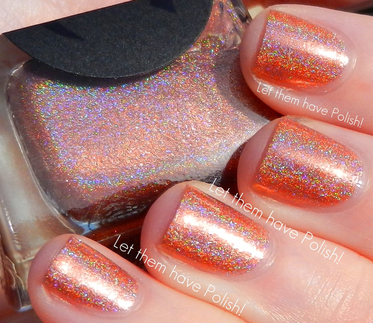
 Cypress is a beautifully unique Copper holographic shade. The formula on this shade is a little sheer but buildable. I used Three thin coats for my swatch.

O.P.I Lonesome George 
  Lonesome George is an amazing Emerald Green holographic shade. I am pretty much in love with this beauty. The formula on this shade is fantastic. I used Three thin coats for full coverage.
 I have to say that I am just so impressed with Cirque's creations. I can't wait to see what else they have up their sleeves for 2013. My faves from this group would have to be Planet Caravan, Lonesome George and Fleur est Belle.

 The Objet d'Art Collection is available now from Cirque's shop as well as many other e-tailers. Do you have any favorites in this group?

(**Cirque Polishes provided for my consideration**)

More aboutCirque Objet d'Art Collection Swatches: Part Two